
Fit24Gyms
Weaverbird Marketing
Client
Fit24Gyms

The Challenge
Fit24Gyms is a privately owned fitness brand with ambitions to become a leading name in the industry across Southern Africa. As the brand grew, its identity lacked consistency and cohesion across touchpoints.
Fit24Gyms approached Weaverbird to refresh the brand identity.
The solution, from the farm, to your fork.
I was the lead designer on the account (Our biggest retainer at the time) and responsible for running all the creative.
My Creative Director and I started with a complete overhaul, enhancing nuances like typography, imagery, and bringing in more meaningful graphic elements.
Read more about my process
We held daily strategy sessions, with a significant amount of research invested in finding the right aesthetic and staying up-to-date with current design trends.
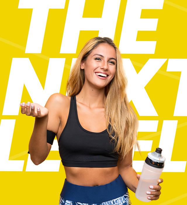
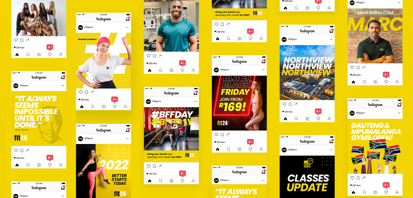
Additions like bold italicised fonts, which brought in movement, graphic elements and striking strategic imagery (which should always capture the inspirational, bright and enthusiastic gym life) helped elevate the brand to a stage where the refreshed visual language was signed off.
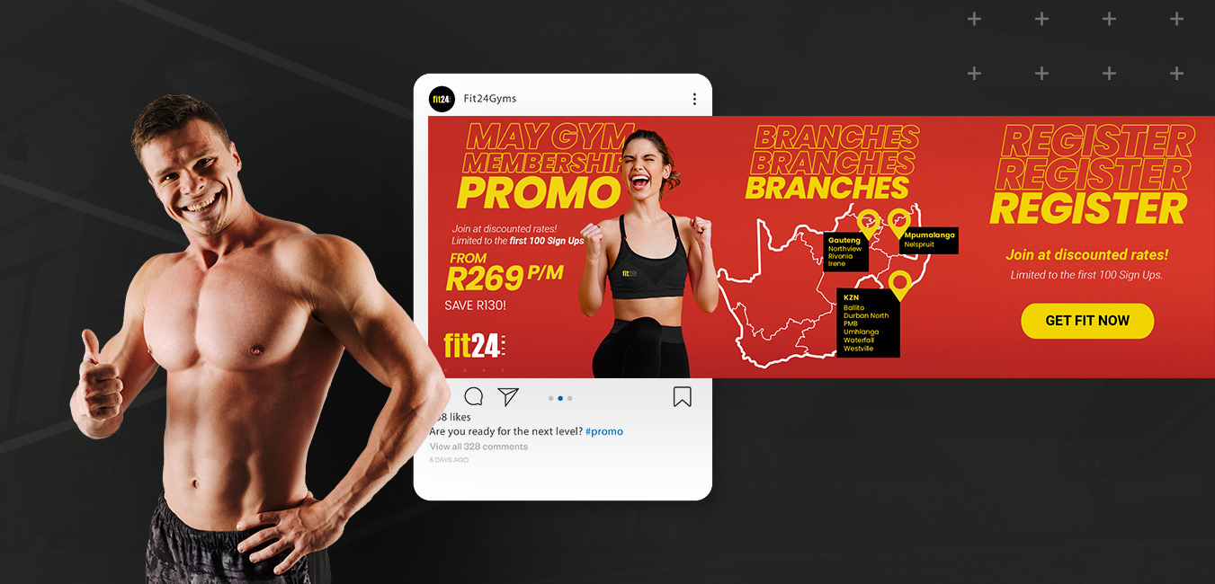
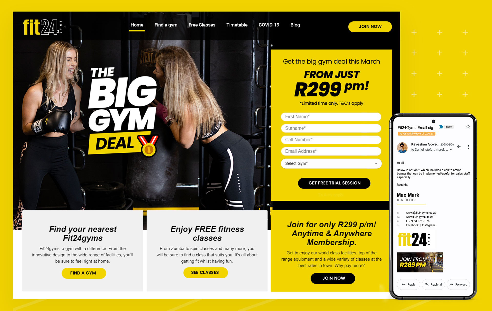
The team and I refreshed all aspects of their marketing channels, some of which include:
– Social media content management
– Social media management
– Community management
– Print Collateral in all brand activations
– Web design, development and maintenance
– Organic Search Enhancements (Google my business listings)

Visual Language
We wanted the art direction to align with the brand’s innovative modern-industrial architecture, trendy murals, range of cutting-edge facilities and unique vibe at the gym.
This is carried out in closely selected brand imagery which should always capture the inspirational, bright and enthusiastic gym life as well as modern trendy typography which depicts movement and bold use of colour which ties in the atmosphere at the gym.

Visual Language
We wanted the art direction to align with the brand’s innovative modern-industrial architecture, trendy murals, to the range of cutting-edge facilities and unique vibe.
This is carried out in closely selected brand imagery which should always capture the inspirational, bright and enthusiastic gym life as well as modern trendy typography and bold use of colour.
Fit Yellow
C 7 M 11 Y 100 K 00
RGB 241 212 0
PANTONE: Yellow C
#f1d400
Rich Black
C 20 M 20 Y 20 K 100
RGB 000 000 000
#000000
Graphic elements

The “more than” arrows are used to depict the world-class facilities and superior atmosphere you experience at the club. The graphic is also used to guide the user’s eye to the next element.

We strategically used the plus/addition symbol to visually represent the value for money aspect that the gym brings to the community.

The circle represented the notions of totality, wholeness and all cyclic movement. In many ways it also portrays the unity aspect of the Fit24Gyms tribe.


Typography
Headings

Body
Roboto
Aa123
Impact font


Print collateral
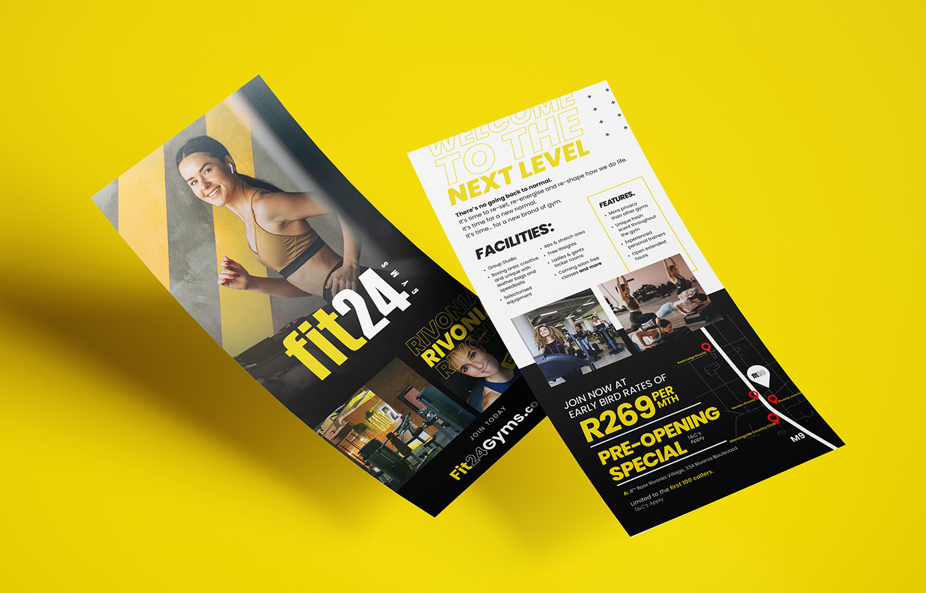
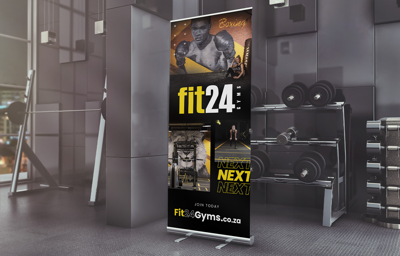
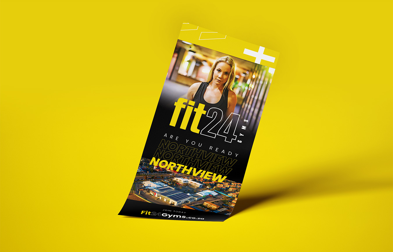
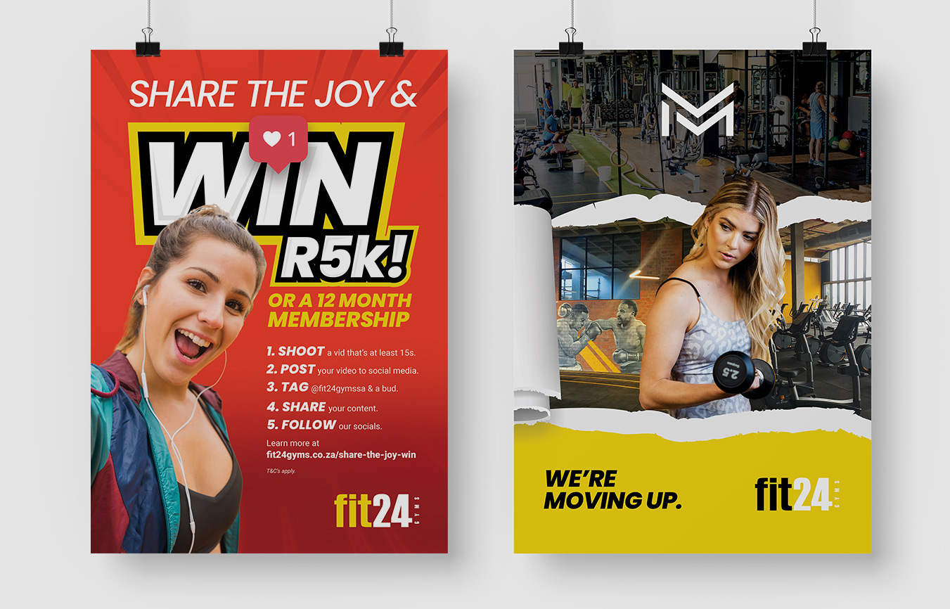
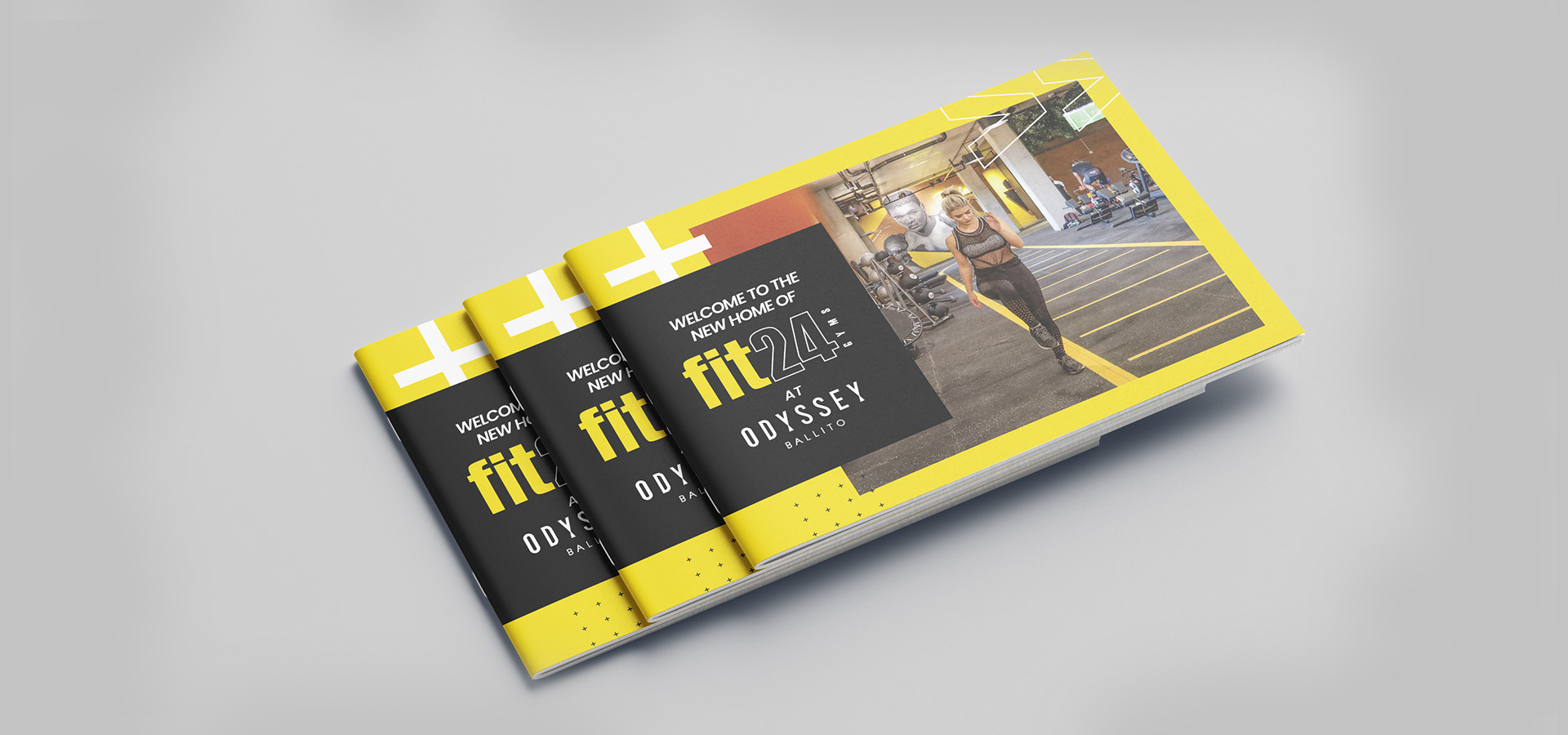
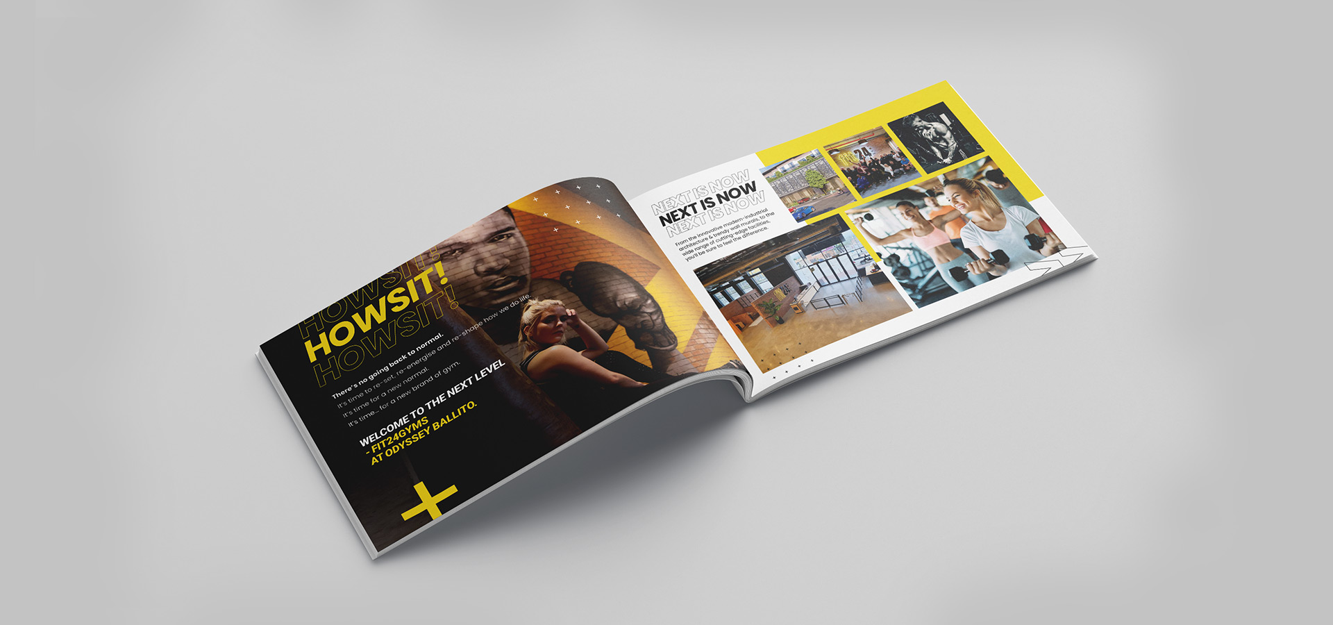
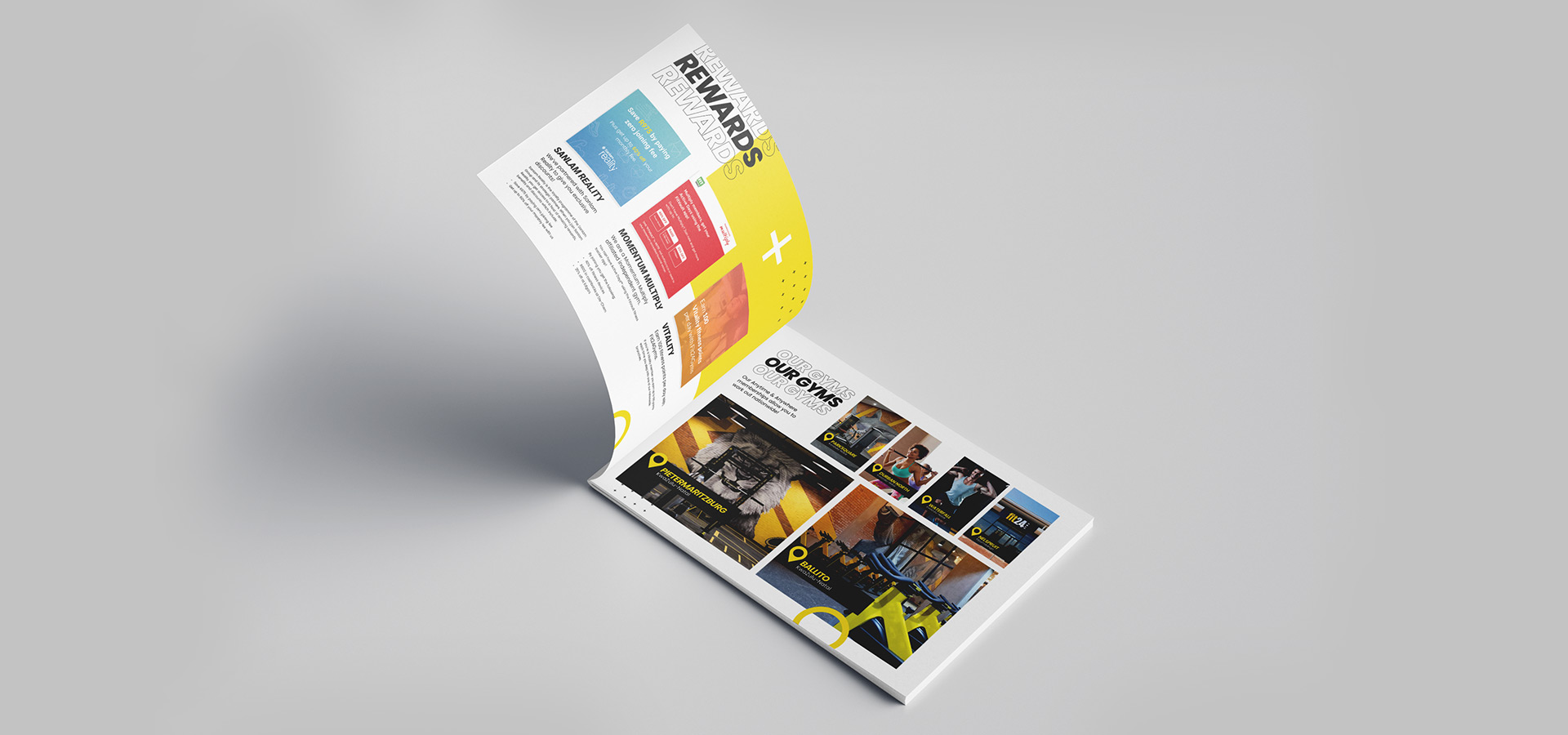
Being in the people-centric industry that Fit24Gyms is in with every campaign came brand activations. The sales team would set up in a strategic area, whereby an array of traditional print materials would be needed.
We’ve curated brochures, flyers, and banners to assist in making the sales pitch easier as well as serving as a call to action whilst walking by.

Credits
Agency: Weaverbird Marketing
Creative Director: Daniel Skaftouros
Integrated Designer: Kaveshan Govender
Web Developers: Noma Faith Zulu & Kaveshan Govender
Copywriter: Chirene Hughes
Explore More Work

SPAR Christmas
SPAR Christmas
DiMetro
DiMetro
© 2026 Kaveshan Govender. Designed and developed by Myself & Bioplus 😂