
Farmers Club
Weaverbird Marketing
Client
Livestock Wealth

The Challenge
Livestock Wealth supplied one of South Africa’s leading retailers with premium, free-range beef and wanted to deliver directly to customers for a slice of the price.
The task was simple: create a brand that speaks to the premium organic beef that is supplied, in keeping with the nuances of the LSW identity.
The solution, from the farm, to your fork.
I began by analysing and interpreting the brief so that I could understand every box that needs to be ticked. (Pun intended)
Words like, “premium”, “organic” and a connection to the parent company were highlighted.
I kept those 3 keywords in mind whilst conceptualising the brand, as I moved forward in the design process
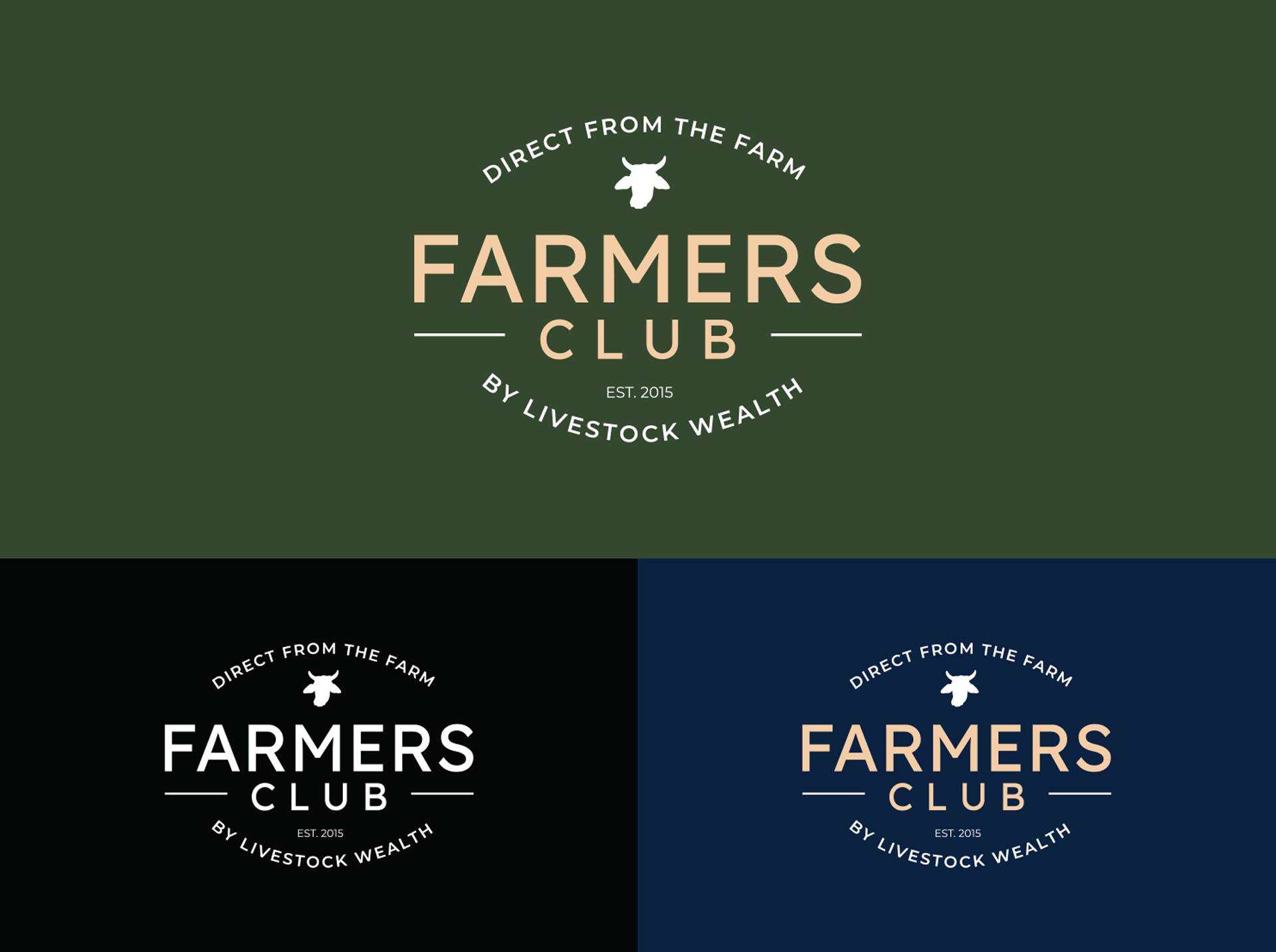
The logo went through the refinement process, and the end result is a logotype that was constructed with a modern sans-serif typeface, with the lock-up creating a sense of farming, heritage and premium quality.
Read more about my process
This ticked most of the boxes besides bringing in the parent company’s (Livestock Wealth) presence. I opted to go the subtle route, with inverted versions of the LSW cow icon appearing, as well as their primary corporate font – Montserrat.
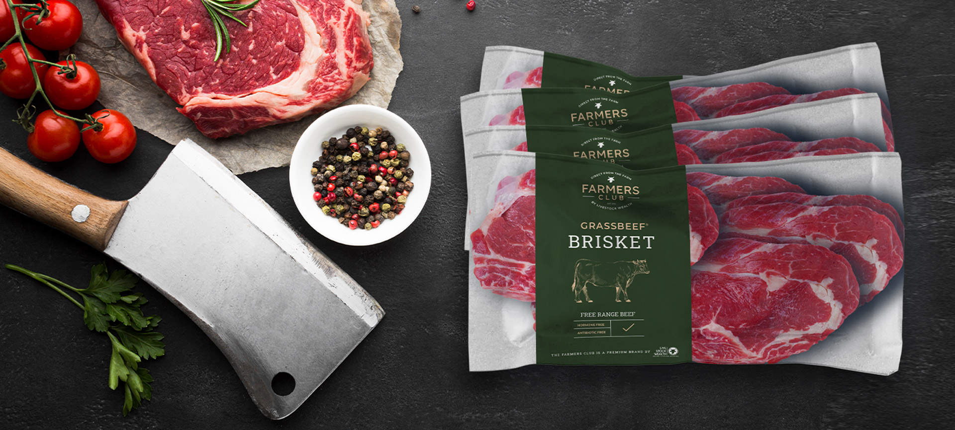
The next step, being the most daunting of all – is packaging design.
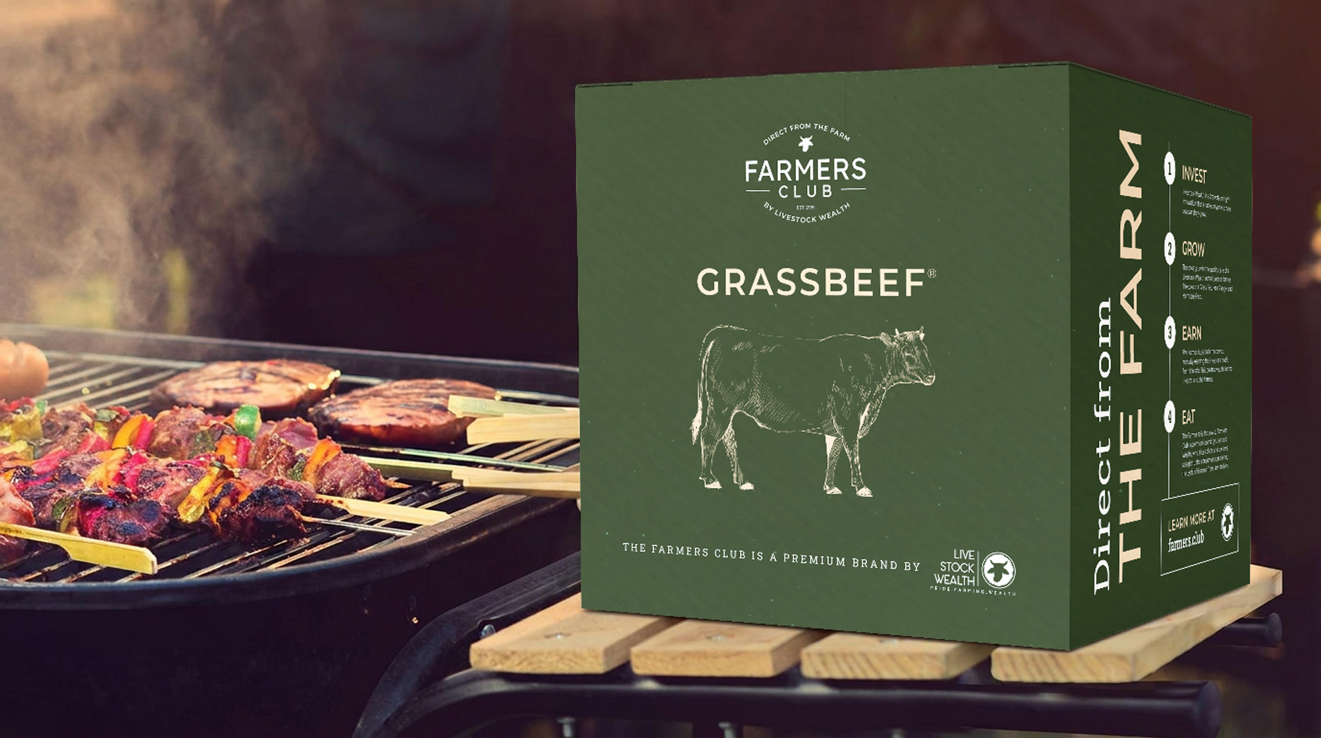
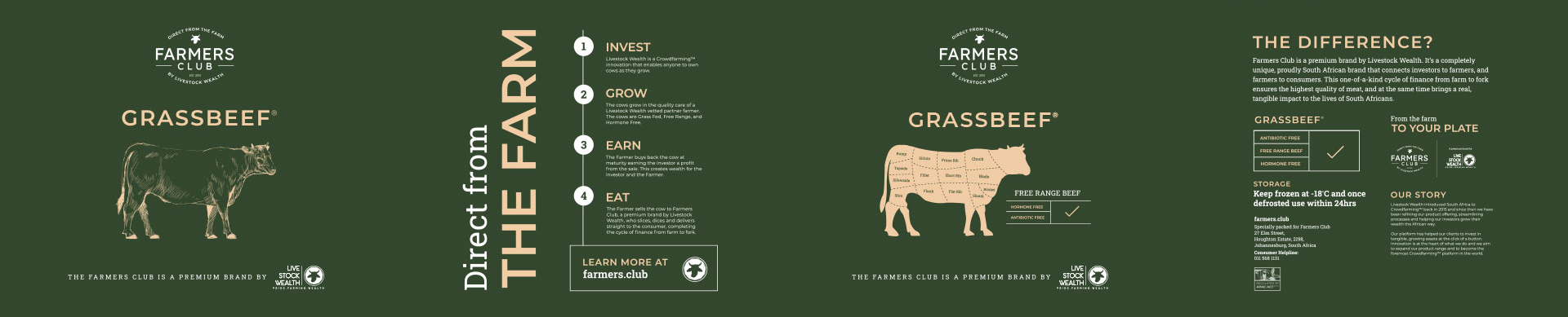
Farmers Club required a beef box designed so well, that it should be “worthy of being purchased as a standalone item as the box itself is pivotal in their marketing strategy.
With that being said, I took on the challenge, I tackled the project step by step, throughout my greatest friend was following a branding series by The Futur.
The research phase helped me immensely! I feel nuances like typography, graphics and printing techniques I found assisted in me achieving the result.
Thankfully through an extensive process, I was paired with a brilliant, experienced printer willing to take my call at any hour with answering any concerns or inexperienced questions I had.
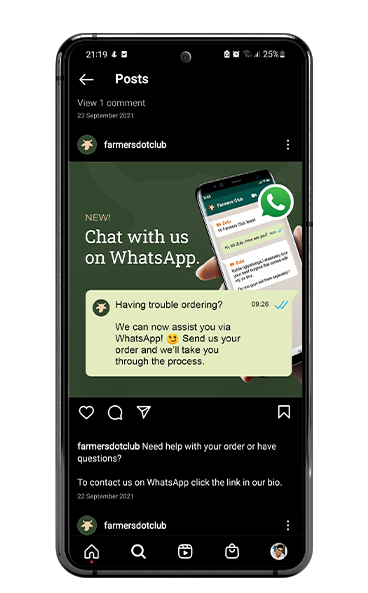
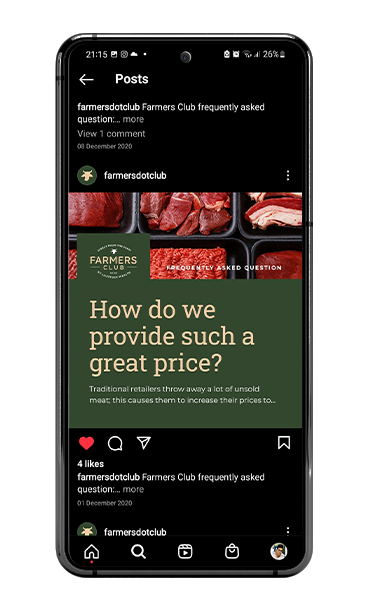
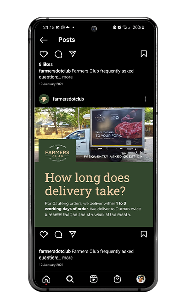
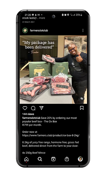
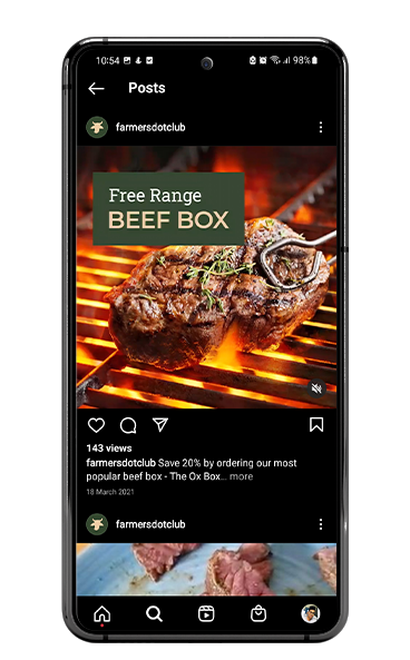
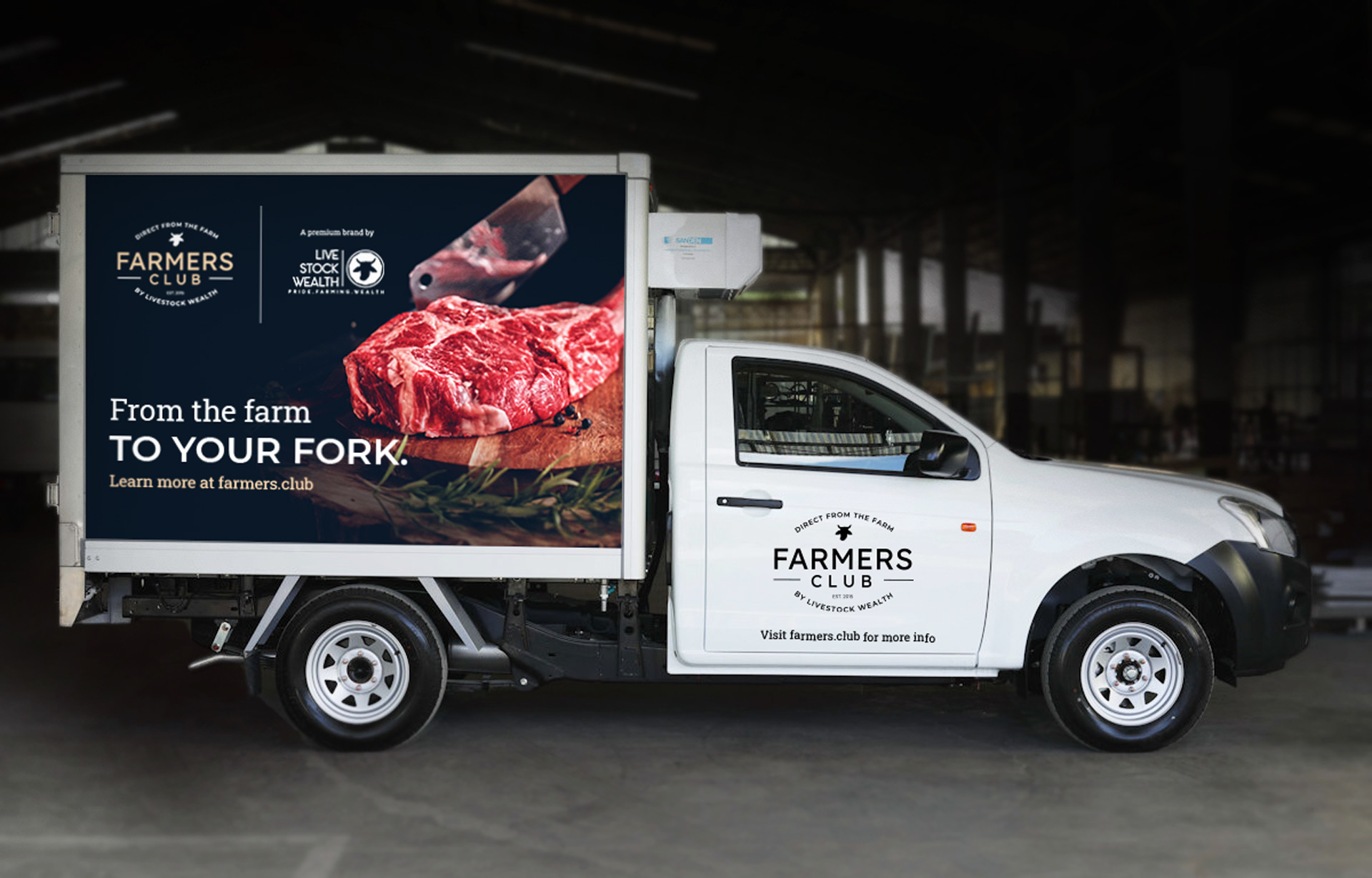
The next steps fell into place perfectly, with vehicle branding (Where due to unforeseen circumstances I had to measure the truck with the CEO), sticker designs and digital advertising being web development, email marketing and Facebook advertising.
Overall, I am extremely proud to be the Lead designer and Art Director on this massive branding project and feel to date that this is my best work.
Visual Language
Farmers Club is an extremely unique, premium brand. I chose a mixture of Slab-serif and Sans-serif typefaces with the goal to create a heritage look and feel that compliments the logotype.
The colour palette ties this in symbolizing the organic, free-range premium product on offer.
Green
C 73 M 48 Y 82 K 50
R 51 G 71 B 46
PANTONE: 5743 C / 2411 U
#33472E
Cream
C 73 M 48 Y 82 K 50
R 51 G 71 B 46
PANTONE: 5743 C / 2411 U
#33472E
Blue
C 73 M 48 Y 82 K 50
R 51 G 71 B 46
PANTONE: 5743 C / 2411 U
#33472E
Typography
Headings
Roboto Slab
Aa123
Body
Montserrat
Aa123

Website Design
The main goal of the website was to highlight the products on offer, I chose to achieve this with a simplified header, resulting in the products being above the fold.
The eCommerce site is currently their main avenue of sales, generating an average of R100k per month!


Credits
Agency: Weaverbird Marketing
Creative Director: Daniel Skaftouros
Art Director: Kaveshan Govender
Account Manager: Murunwa Mafadza
Integrated Designers: Kaveshan Govender, Gwen Isaacs & Bonga Nxumalo
Web developer: Noma Faith Zulu, Daniel Skaftouros, Kaveshan Govender
Copywriter: Lee Laubscher
Explore More Work
Fit24Gyms
Fit24Gyms
SPAR Freshline
SPAR Freshline
© 2026 Kaveshan Govender. Designed and developed by Myself & Bioplus 😂